Unified Marketing Performance Dashboard
The goal was to design a unified dashboard that brings together data from GA4, Google Search Console, CallRail, and the client’s CRM into a single, cohesive view.
The system lets teams filter KPIs, lead sources, and phone calls across platforms while supporting client specific metrics. Accurate UTM to CRM mapping ensures reliable attribution and clean data flow, helping teams identify gaps and make confident decisions.
- Project
- U.S Based Digital Marketing Agency
- My Role
- UX/UI Designer
- Category
- B2B | SAAS | Data & Analytics Dashboard
- Platform
- Custom Analytics Dashboard | Responsive UI
- Tools
-
U.S Based Digital Marketing Agency
A U.S.-based digital marketing and communications agency specializing in data-driven growth, performance marketing, and strategic brand development for B2B and enterprise clients.
The Problem
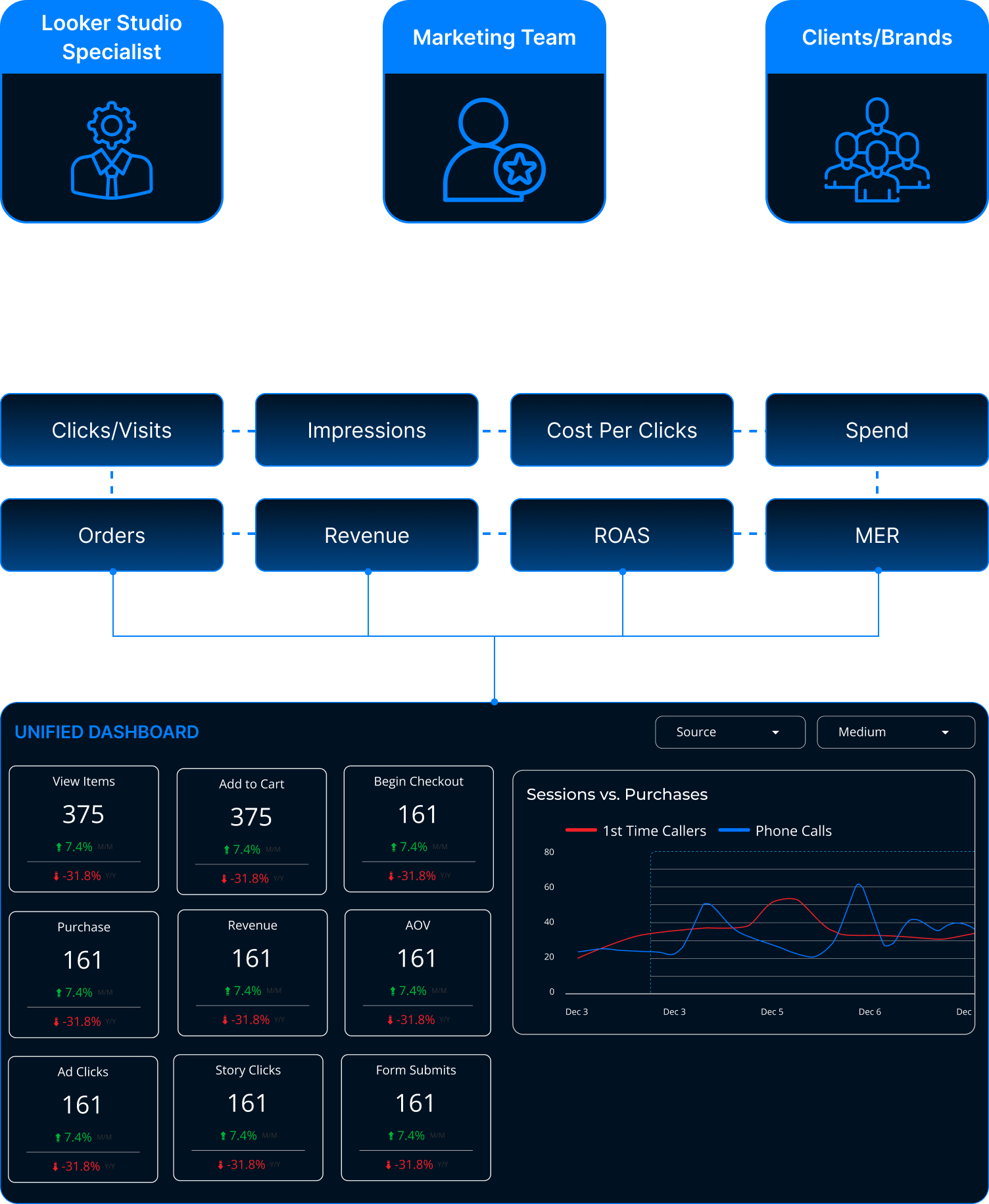
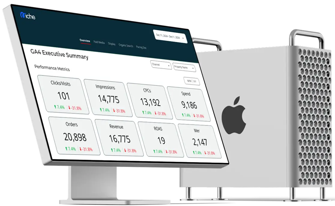
The existing dashboard experience did not meet brand standards or match the quality of comparable products in the market. Inconsistent UI & color usage resulted in a fragmented experience & weakened brands product identity.
- Inconsistent dashboard designs and brand colors created a fragmented client experience
- Lack of a unified design system weakened brand’s overall product identity
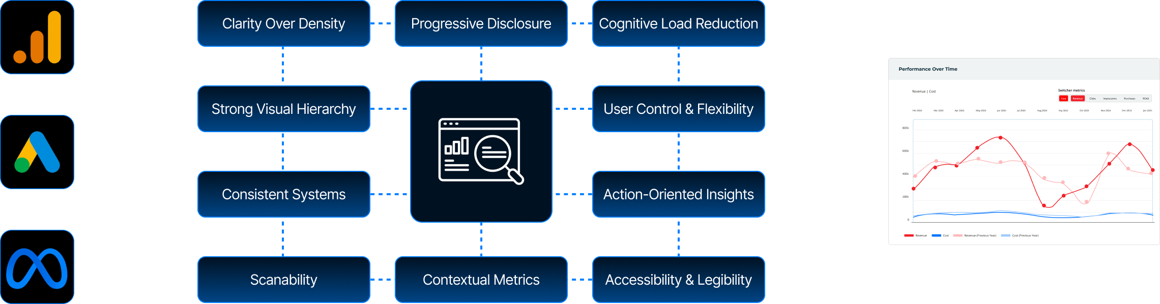
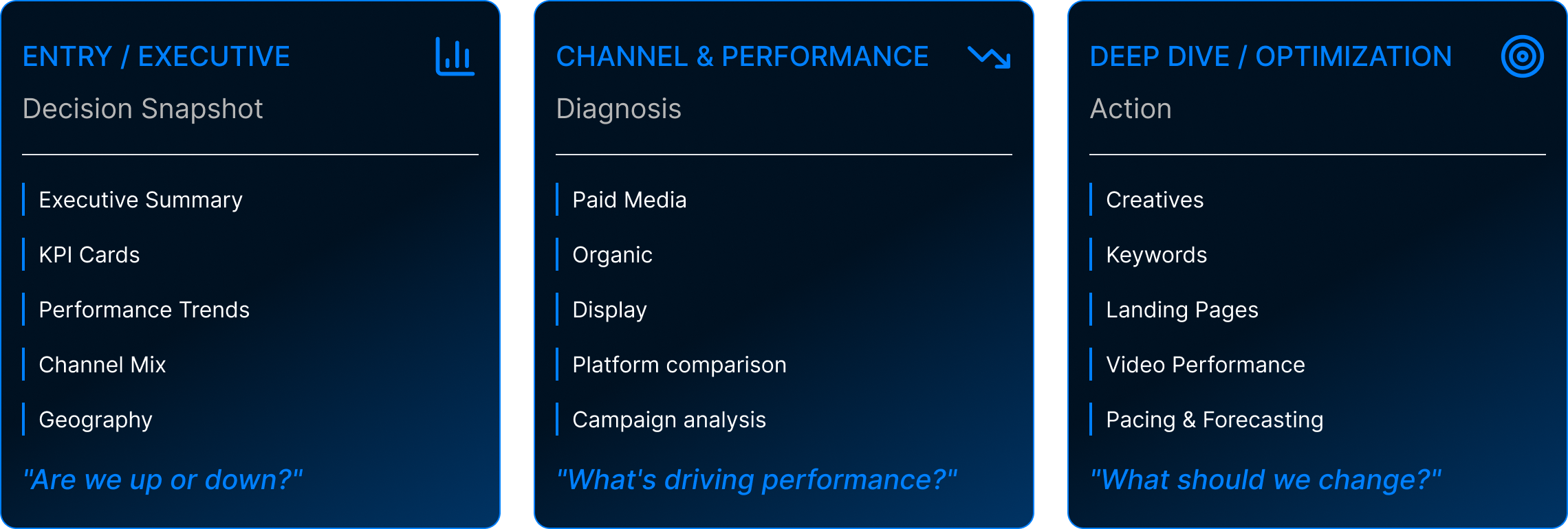
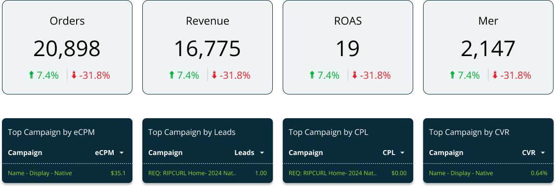
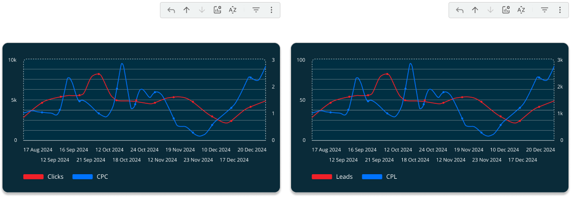
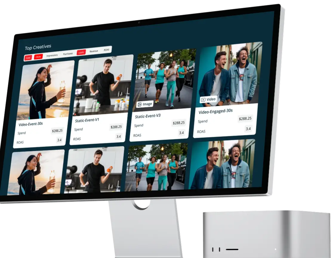
- Poor visual hierarchy made key metrics hard to scan and understand
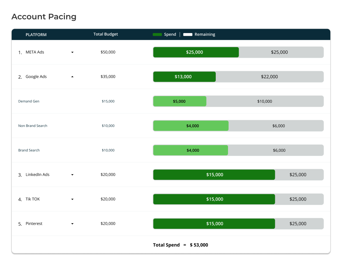
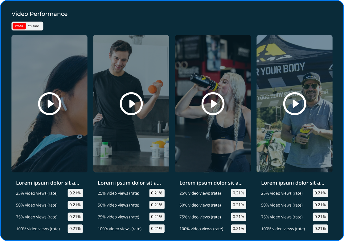
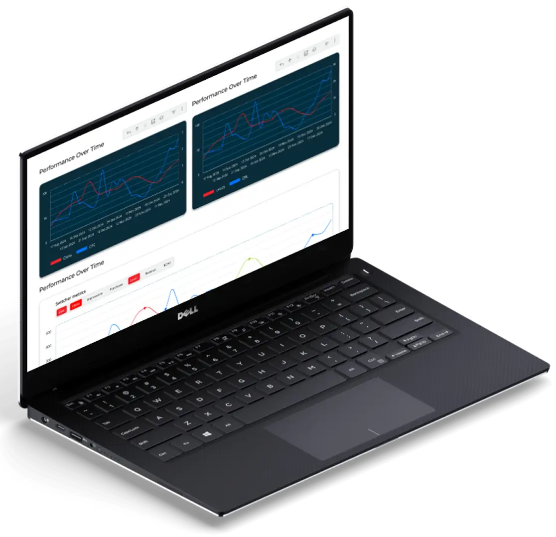
- Data visualizations were unclear, increasing confusion for clients
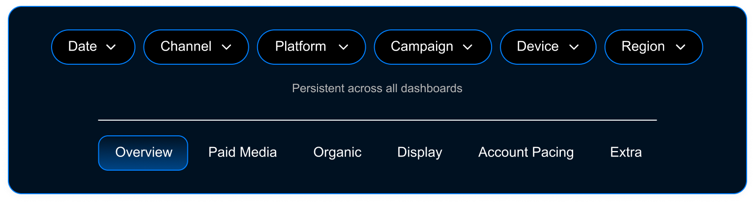
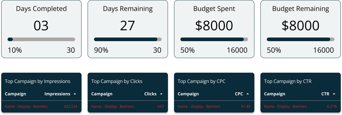
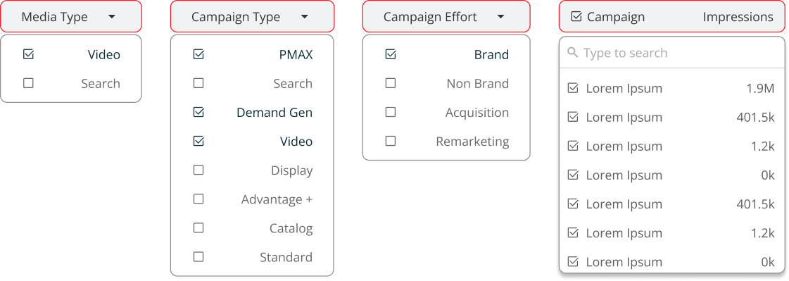
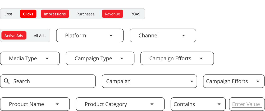
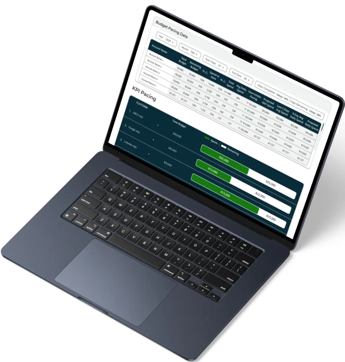
- Limited filtering made it difficult to explore and compare performance data
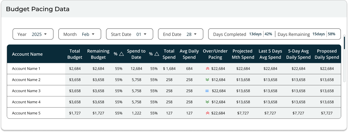
- Inconsistent structures made dashboards hard to maintain and scale for the team
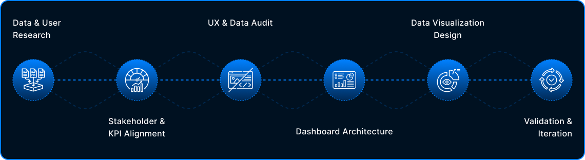
The core question we needed to answer:
Does the dashboard help users understand their data effortlessly, or does it only look visually appealing?
The Goal
The goal was to revamp the existing website to:
- Establish a unified and consistent dashboard design system across all clients
- Improve data visualization to make key metrics easy to scan and understand
- Create a clear visual hierarchy that highlights the most important KPIs
- Enable flexible filtering so users can explore and compare performance data easily
- Support scalability with reusable components for faster setup and maintenance
- Deliver a dashboard experience that aligns with brand standards and market expectations
Design Process
The process began by understanding user needs and key metrics, followed by a UX and data audit to uncover usability gaps. Insights were used to design a scalable dashboard structure and clear data visualizations, which were refined through ongoing validation and iteration.
Design is never final. Post-launch insights, data, and feedback continuously shape future iterations.
Stakeholder & KPI Alignment
What It Solved
Shifted focus from vanity metrics to actionable KPIs.
Built a dashboard designed for real decisions, not just visibility.
Data & User Research
UX & Data Audit
Key Audit Findings
Inconsistent data visualization patterns across dashboards
Weak visual hierarchy made critical metrics hard to scan
Charts prioritized volume over insight, increasing cognitive load
Similar metrics appeared in multiple places with different contexts
Limited filtering & comparison reduced exploratory analysis
Dashboards reported data but did not guide decisions
Dashboard Architecture & Decision Flow
01 GLOBAL NAVIGATION
02 MENTAL MODEL
03 PROGRESSIVE DISCLOSURE
LEVEL 1 — EXECUTIVE OVERVIEW
Executive Overview (GA4 Summary)
DRILL-DOWNS
LEVEL 2 — CHANNEL PERFORMANCE
Paid Media Overview
DRILL-DOWNS
LEVEL 2 — CHANNEL PERFORMANCE
Display Overview
DRILL-DOWNS
LEVEL 3 — OPTIMIZATION & CONTROL
Account Pacing
DRILL-DOWNS
LEVEL 3 — OPTIMIZATION & CONTROL
KPI Pacing
DRILL-DOWNS
Landing Page Performance
Conversion Rate Impressions Cost Per Click
Keywords Heatmap
Click-through Rate Quality Score Position Trends
Video Performance
View-through Rate Engagement Completion Rate
04 END TO END FLOW
Data Visualization Design
01| KPI Summary & Trends
UX Focus: Clear hierarchy and fast scannability
02| Performance Over Time & Comparison
UX Focus: Time context & comparison for decision-making
03| Funnel & Flow Visibility
UX Focus: Reduced cognitive load through clear progression
04| Precision, Filters & System Consistency
UX Focus: Insight-first design with scalable system thinking
What Went Wrong
Where usability, scalability, and system constraints surfaced gaps
-
Limited Scalability for Growing Data
Some visual patterns didn’t adapt well as data volume increased, leading to clutter and reduced readability at scale.
-
Tool Constraints in Looker Studio
Certain design ideas were difficult to implement due to Looker Studio’s layout, interaction, and customization limitations.
-
Over-Designed Low-Value Metrics
Some metrics were overemphasized when simpler, more scannable visuals would have worked better.
-
Iteration Exposed System Constraints
Scalability and feasibility considerations became clearer as designs were tested against real data and platform limits.
Validation & Iteration
Identifying these gaps helped refine the approach, ensuring future iterations balance clarity, scalability, and platform constraints more effectively.
Collected feedback focused on insight clarity, ease of scanning, and decision speed without additional explanation.
Identified which metrics drove action versus friction, then reduced visual density and deprioritized secondary metrics.
Refined patterns to scale reliably across datasets and clients, aligning the dashboard with actual usage behavior rather than assumptions.
Iteration was guided by observed user behavior and platform constraints. Design decisions prioritized clarity and scalability over visual preference.
What I’d Do Differently
Validate scalability and Looker Studio constraints earlier with live data
Stress-test visual patterns against extreme data cases sooner
Prioritize decision clarity over visual variation from the first iteration
This project reinforced how I approach dashboard design. I start with clear intent, validate ideas through real usage, and build systems that scale with both data and decision making.